
When making design changes, it is important to be mindful of the diversity of your readership and inclusive of users’ needs and circumstances. In addition to visual impairments, users may be affected by hearing, cognitive, and motor limitations when browsing a website; others may have a different social or cultural background that may alter their understanding of content. These circumstances may be permanent, as with colour vision deficiencies (CVD), or temporary, as with browsing on a smaller screen with a slow internet connection.
In this guide we will focus on visual impairments specifically, but it is always valuable to maintain clear and concise editorial standards so that your articles reach and remain accessible to as many researchers or readers interested in your field as possible.
As of OJS/OMP/OPS 3.3, the Default Theme has been externally audited for accessibility and adheres to best practices like colour contrast, keyboard navigation, and form/link focus. PKP Accessibility Statement contains further details. Note that changes made to the theme may impact accessibility.
You can use WebAim’s Contrast Checker, Contrast Ratio Checker, or the Colour Contrast Analyser to check the contrast ratio between your website’s background and text colours and make sure it is accessible based on the WCAG 2.0 Guidelines.
Most OJS 3 themes allow you to customize the main or header colour of your website. With WebAim’s Contrast Checker, for example, you can check whether you should use black or white text, as well as header logo, with your main colour of choice in order to ensure readability for users with visual limitations. In the following example, the user is testing out a pink as well as a purple selected to match their homepage cover image.
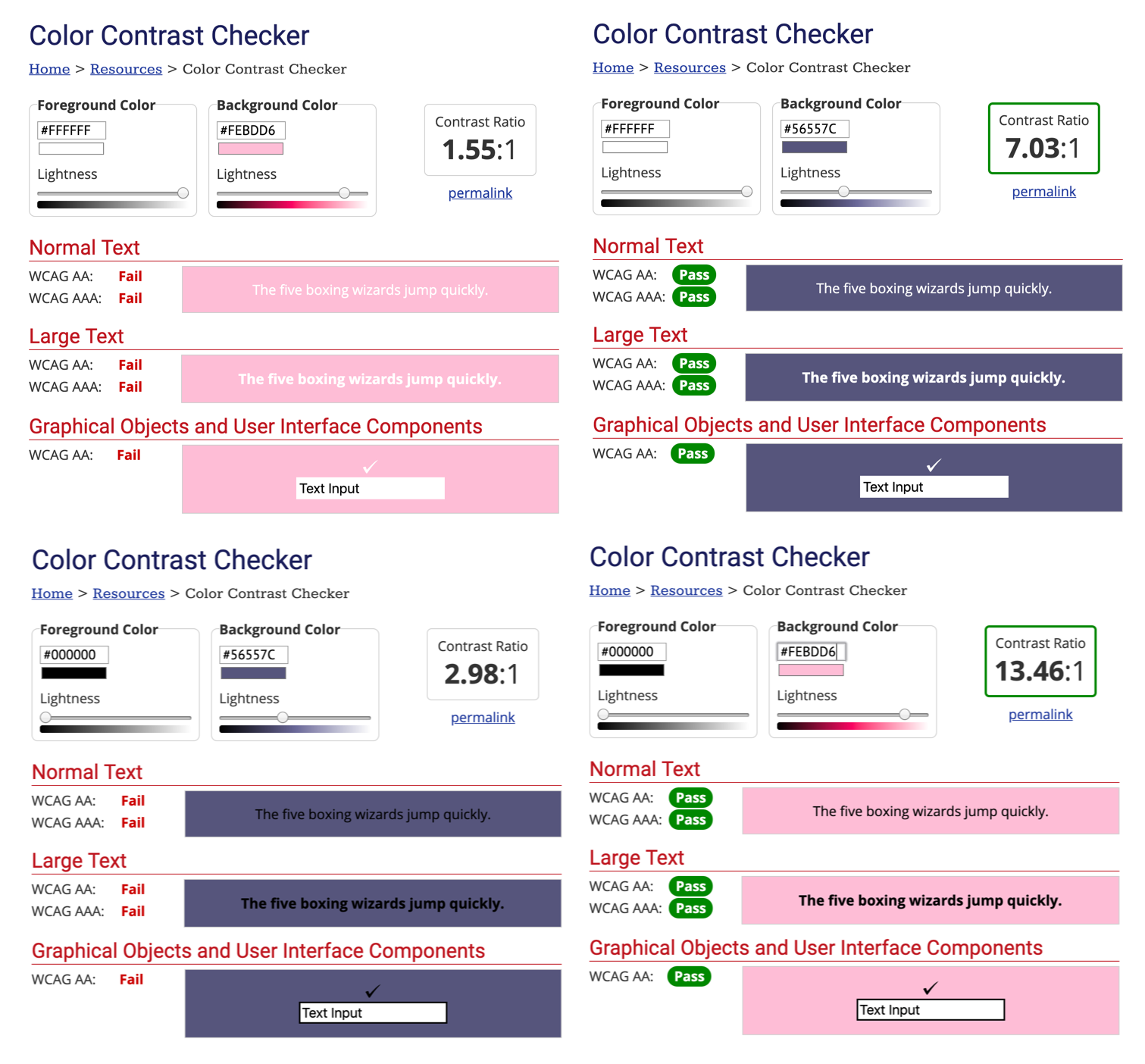
The test recommends that the user only display black text on pink or white text on purple. Therefore, the user has two accessible options using these colours:
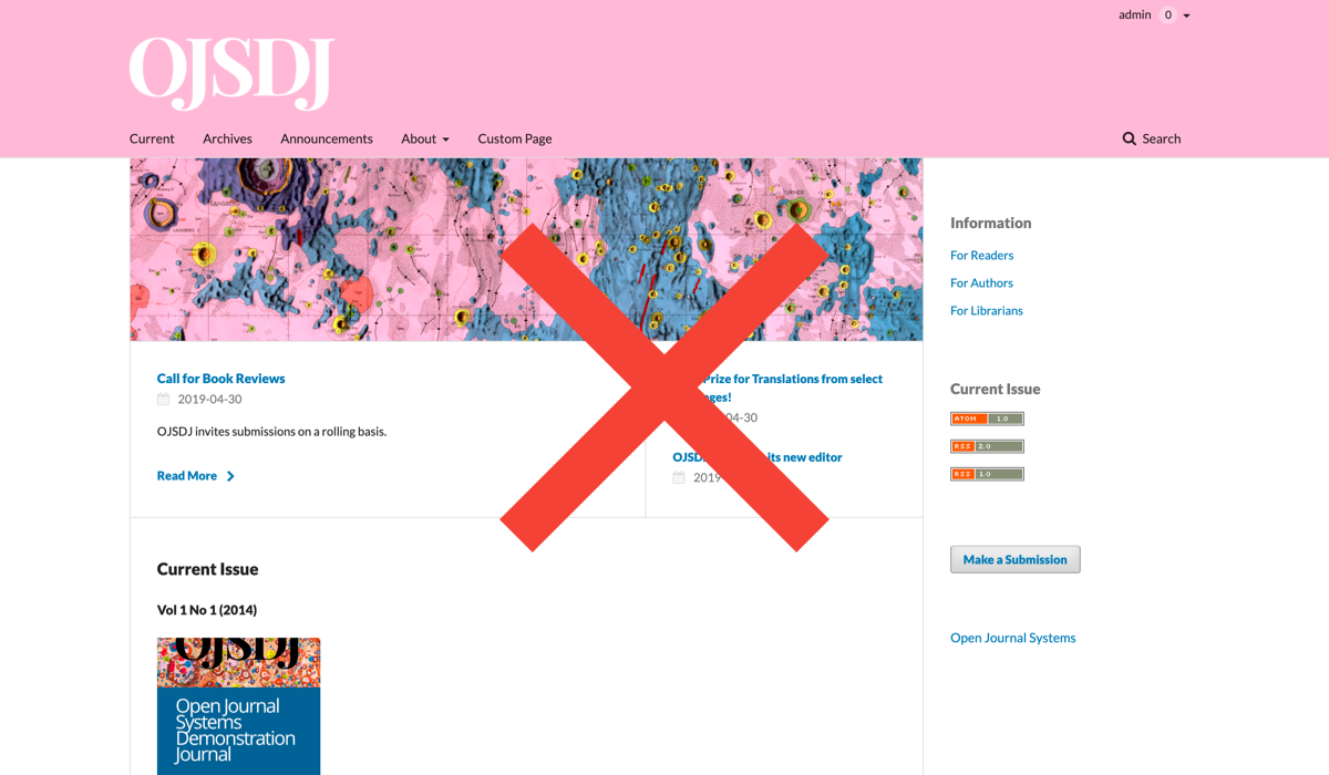
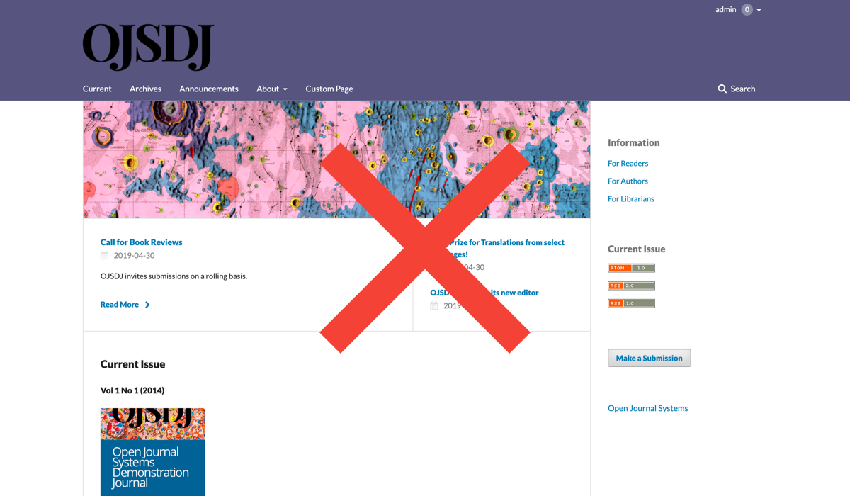
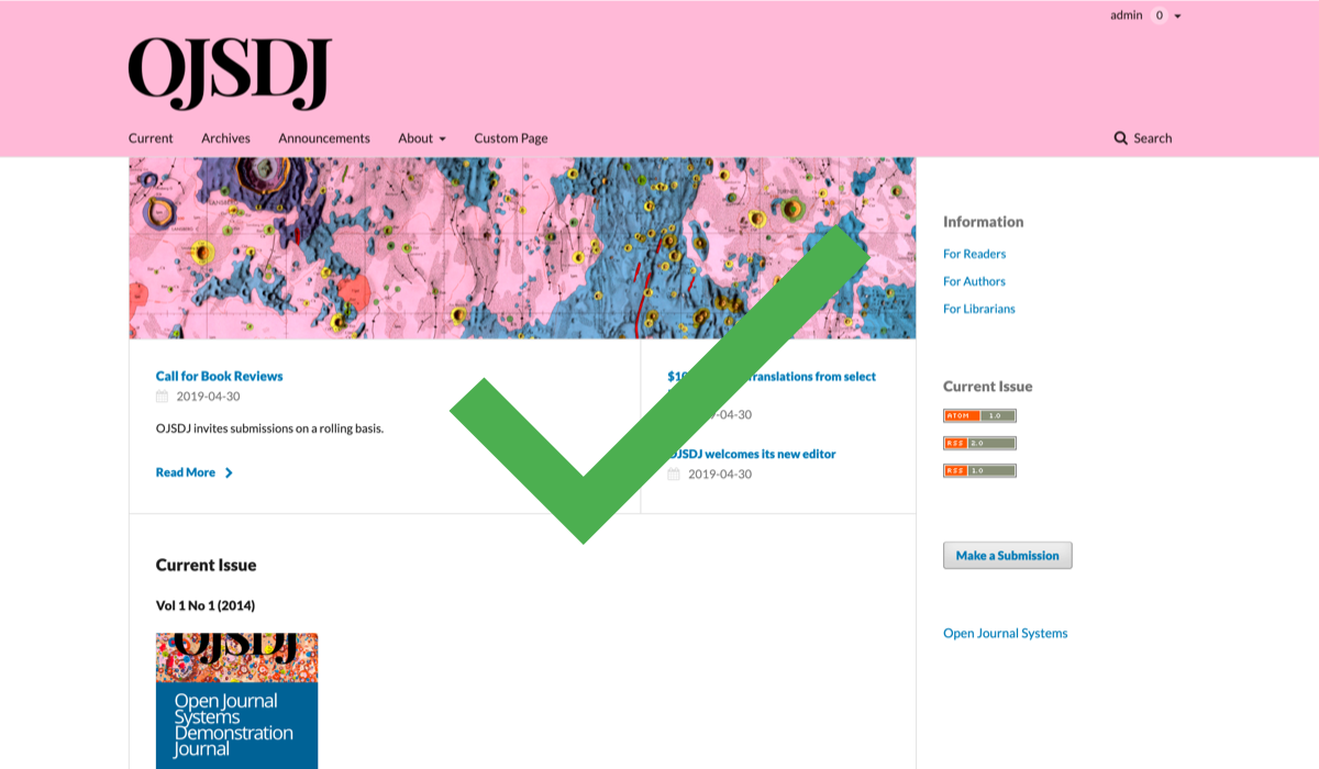
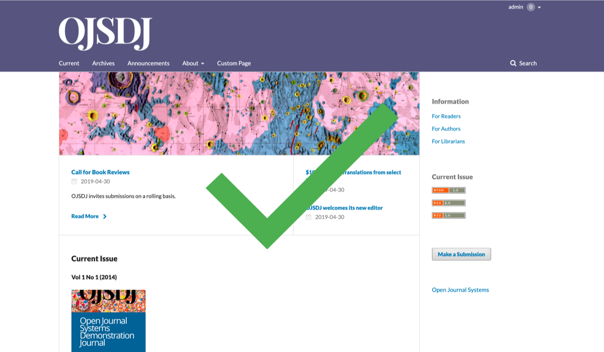
Additionally, with tools such as the Spectrum Chrome extension you can emulate various types of colour vision deficiencies (CVD) on any website. Tools like the Accessible Color Palette Builder can help you decide on the best colour combinations for your website.
Text colour should not be the only way of conveying important information, since it may not be available to a person with CVD and will be unavailable to screen reader users. Consider other visual emphasis (bold, italic) OR an explicit mention (in plain text) that the following information is important.
You should provide ‘alt’ (alternative) text for images unless they are decorative or the text is present elsewhere on the page. Having such text is especially helpful for people with visual impairments who rely on a screen reader to have the content of the website read to them.
Alt text can be added in designated fields or in the HTML.
<img src="learning-ojs3.1-jm-settings-workflow-sublib1.png" alt="submission library textbox">
Make sure to use descriptive language (e.g., describing a photograph in detail: “a woman in a lab coat holding a petri dish in a bright laboratory”). Avoid using “image of…” at the start of your description.
When writing URL text, make sure it can be understood without additional context. For example, use “see Author Guidelines” rather than “click here.”
When writing web content, ensure that:
<h1>, <h6>) are used to separate content in longer text. Heading levels should not be skipped in the ordering (e.g. <h1> - <h2> - <h3>) so that a screen reader can navigate correctly through the page - for example, the following is invalid because a <h3> follows directly after a <h1>, without a <h2> between them:<h1>Title</h1>
<h3>1 XXXX</h3>
<h2>2. XXXX</h2>
<h1>Title</h1>
<h2>1. XXXX</h2>
<h2>2. XXXX</h2>
<h3>2.1 XXXX</h3>
<h3>2.2 XXXX</h3>
<h2>3. XXXX</h2>
<h1> on a page. Usually, the theme provides the <h1> and you do not need to create this.<th> element).Non-HTML content, such as documents you upload, should be accessible as well. When creating journal documentation, such as author guidelines, style guides, etc., consider presenting them as static HTML pages rather than uploading PDFs to the website. If using PDFs, ensure that they are appropriately tagged to be screen-reader friendly. PKP’s guide Creating Accessible Content: A Guide for Journal Editors and Authors contains further details and resources.
When modifying the theme of your journal website, ensure that it remains accessible by checking your journal on different browsers and on various devices.
Additional online tools such as Wave browser extension (free) or axe DevTools (free) can facilitate website auditing. Tabbing through your pages with your keyboard and using a screen reader such as NVDA (free) JAWS, or VoiceOver (free) can help ensure that your website is accessible.